A nice little study I found on the Japanese culture website 'PingMag' looking at handmade typography in Bali!
"On a little excursion to Bali, I came across some lovely colorful typography. Pretty much all signs on the side of the road, in temples, restaurants or shops are still hand-painted, carved or “made” in some other form. A truly refreshing sight for us computer-output-people who too often forget that once there was a skillful hand swinging the brush and painting letters…"
I think this is so relevant to my study of typography for the Comm Tech brief.
The reason for a lot of these signs being hand rendered is unclear, they could not be aware of computer software which will produce their signs, they could not have access to it, or they might just not be interested in using computers. They have created signs which are perfectly coherent, individual and eye catching.
See the full post here.
Friday, 30 January 2009
Thursday, 29 January 2009
Perfect vs. Practical
"We are so obsessed with the Net and technology that we forget the message... We imagine to be able to do anything, and our software helps us believe we can... But we must move beyond the 'how' to reconsider the 'what' and the 'why'..."
Neville Brody
Comm Tech II: Nice one, Erosie
"I try to look for the parallels between, and the nuances of the graffiti-codes, the illustrated image, commercial visual language and the traditions of art, since all of these fields belong to my background and my present-day interests...."
Website HERE
Website HERE
Wednesday, 28 January 2009
Comm Tech II: To You, Love Me
"Monica Nelson is a graphic designer living and working in New York City. She is originally from Athens, GA, but recently graduated from Pratt Institute."
Such pleasing typography on her website www.toyou-loveme.com. Alot of it is based around handmade and bound publications. It looks as though she prints by laser. Smooth!
Tuesday, 27 January 2009
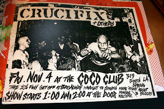
Comm Tech II: Effed Up n' Photocopied
Monday, 26 January 2009
Sunday, 25 January 2009
Comm Tech II: Hand Job
I like the idea of making do with as little technology as possible. We're relying a lot on these amazing adobe suites. It would be interesting to take it back a step and look at the world before my generation, who learnt to use photo shop before learning to wipe themselves properly. Of course, there are plenty of artists and illustrators around now who are just using hands, as demonstrated in Michael Perry's book 'Hand Job';
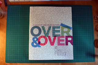
Perry's really into that sort of thing, so brought out another book, Over & Over, this time about pattern, and it has a considerable amount of hand rendered pieces;
I found a publication while in Stockholm called Museum paper, and although its contents were very digital media based, the consistent layout of the book had a hand rendered style;
Another swedish book was this small book, a collaboration of 2 illustrators; Joakim Ojanen & Hanna Andersson, full of hand drawn illustrations;
Friday, 23 January 2009
Comm Tech II: SEW KEWL
Got this book from a car boot sale last summer, mostly because it was 50p but also because I've never looked at embroidery as a form of typography.
Iva Polansky, the author of 'Cross Stitch Calligraphy' starts the book by looking at 'The evolution of western lettering' which quickly leads her onto 18th century 'samplers' like the one above.
The book really celebrates embroidery as a way of creating typography, 'Needle calligraphy has its own rewards. The print-like quality and special texture of the letters are impossible to achieve by any other means.' says the foreword. Although this book was published in 1994, when digital design suites were not as developed as they are now, I still feel this statement still applies, and it would be interesting to work with embroidery to make my own typography.
When Channel 4 were advertising their docu-soap 'The Family', they had a campaign which made me wish I had got there first;
The idea of having a cross stitch to resemble traditional family life, then to see the stitches falling apart is a poignant one, and represents the concept of the TV show perfectly.
I'm not entirely sure how this poster was made, but it looks like a photo or scan of an actual embroidery. Cunning.
('The Family' photos taken from SUPERZIPER)
Heres a selection of more samples from the book. Some are pretty gay, but for back then, some of them are pretty cool.
I love the black shadow on the pink H here.
Subscribe to:
Posts (Atom)