Saturday, 28 February 2009

Letters on America

Edward Fella

I just love this book I got out from the Library.


From the foreword 'Off The Road' by Lewis Blackwell;

"These 1,100 or so images are less than a third of the collection amassed by Fella since he first started this series of polaroids in 1987. The project is capturing vernacular lettering detail in this way began on a study trip to San Francisco in the spring of that year."

Of the lettering & signs... "The characters can be found on any surface, as distractions or directions, decoration or marker. They are in wood, metal, paint, sticky-back plastic, etched, behind glass, behind bars, torn and layered. They come alone or clustered together, isolated or juxtaposed, fresh or faded, direct or distorted; from in-your-face dayglo to subtle tones that are obscured, reflected, as shadow, as drop shadow, or even as a sunburnt memory of a lost message."


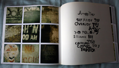


A book like this is so useful when studying typography. Its nice to draw inspiration from the things around us, and looking at your favourite designer's work, but this is effectively just an typographic image database of anonymous signs & type from a place so foreign.

A fine example of using vernacular photography as inspiration for design work was brought to my attention when looking at this book;


An image from 'Letters on America' - A hand written menu in a chinese takeaway;


Poster designed by Roel Wouters, who was inspired by the same kind of thing;


I find particularly interesting the pages in which Fella interprets what he sees into his own designs and illustrations.

I think this book will be useful for this project, seeing just how much of the photos are of hand made signage, But also helpful for the photography elective.

Friday, 27 February 2009

Typography of Hyde Park

I had my black & white photography elective last week, which was all about processing and printing film in the dark room.
Although I am quite familiar with the process of black & white photography and developing, there was a lot I had forgot, and a lot I hadn't been taught. After last week I feel confident using the college's facilities and feel I have much more control over my prints.

Our task is to think up a project, preferably relating to your main studies and produce 6 final prints plus lots of back-up work & research.

My project is 'Typography of Hyde Park', which will document all the interesting typography which can be found in the wacky realm of Leeds' Hyde Park.


Sunday, 22 February 2009

The Ten Commandments of Typography/Type Heresy - Breaking the Ten Commandments of Typography


A good, quick and interesting read by Paul Fenton.

On one side, you will find 'The Ten Commandments of Typography' along with a list of the 'Twelve Disciples of Typography', amongst them the likes of Herbert Bayer of 'Universal' typeface fame and Lazar El Lissitzky of this fame;

                               Beat the Whites with the Red Wedge

... which after you have read this book, you realise he should kinda be on the other side...
'Breaking the Ten Commandments of Typography' - Which lists David Carson as Satan and Edward Fella, Neville Brody and Phil Baines as 'Fallen Angels'.


The Ten Commandments of Typography:

I. Thou shalt not apply more than three typefaces in a document.
Always remember that simplicity reigns over the disarray 
and confusion that the use of many typefaces causes.

II. Thou shalt lay headlines large and at the top of the page.
Raise the headline to a windy height, roar out your 
summons, and beckon with considerable type size.

III. Thou shalt not employ any other type size than 8pt to 10pt for body copy.
The Lord shall not leave unpunished he who 
disregards this rule.

IV. Remember that a typeface that is not legible is not truly a typeface.
The dingbats and disordered fuse fonts that 
foundries hold sacred are all worthless, and 
cursed are all who make them their delight.

V. Honour thy kerning, so that white space becomes visually equalized between characters.
Kerning will save the reader time in deciphering writings.

VI. Thou shalt lay stress discreetly upon elements within text.
The glory of god is to keep things hidden, 
but the glory of the foolish typographer is 
to over-emphasize them.

VII. Thou shalt not use only capitals when setting vast body copy.
Let thine eyes be fixed on the ascenders,
bowls and finials of lowercase type.

VIII. Thou shalt always align letters and words on a baseline.
The lord designed letterforms to coexist 
side by side on an invisible line, so thou 
shalt give them a straight path to follow.

IX. Thou shalt use flush-left , ragged-right type alignment.
Renounce the use of other alignments,
for they bring extra torment upon 
already busy eyes.

X. Thou shalt not make lines too short or too long.
I command you to trust in an utmost of 
seventy characters per line, while a 
minimum of forty shall suffice.

Wednesday, 18 February 2009

Tuesday, 17 February 2009

Forget-me-not

I was intrigued by this exhibition at an gallery in New York called Hanahou. The exhibition is called 'Forget-me-not' and its all about embroidery.

You can view and by all the pieces from the exhibition at the gallery's online shop

Here are some of my favourites thought;

by Kristen Garland


By Jessica Marquez - A little twee, but still lovely, especially the hand stitched type on the last one.


by Kate Durkin


by Vanessa Lauria


by Mary Yaeger - errrrrr


Emroidering your insides seems all the rage lately;

Becky Stern decides to embroider an MRI of her poorly knee...

Old Vs New

I've been mixing contemporary styles of typography with old style crafts (embroidery);


Monday, 16 February 2009

Blackwork

I came across the embroidery style 'Blackwork' when browsing a linked website from Christian, The Cross Stitch Guild.


I really like that its not cross stitch, which allows for much more variation, textures, tones and more choice in direction.

Look how handsome this owl is when done in blackwork;

Digital

Got these off the internet, and my thoughts, after spending so much time with a needle and thread, is that these are so boring, the process is boring. With a needle, thread and blank canvas, you can create anything you like.
I imagine (and hope that) these fonts are only really used to get the embroidery feeling across in a poster or flyer for a craft related event.


Sunday, 15 February 2009

Cross Stitchers Anonymous

I've been getting a little hands on with embroidery as a form of creating type.

I posted earlier about a book on 'Cross Stitch Calligraphy'


I've also been looking at books specifically about 'Samplers';


I had a go at creating my own letters, and Oh Boy! they are time consuming. It's helping me with my question of 'old or new?' While this is such a beautiful craft, and wonderfully theraputic, I'm sure there is a way of getting a similar affect digitally these days.

The 'A' alone took around 2 hours, its highly addictive though.


I was also interested in this book about cross stitching pictures...


I had a go at making a flower!

Friday, 13 February 2009

LETTER MONSTAAAARRRSS!


"My son James is beginning to study letter forms. He's a visual kid (as most kids are) and really likes monsters. So, I designed some Letter Monsters to help him in his studies."
          - Says 'Joey Blog', the man behind these curazy letters.
            Although the characters of the letters show little relation to the 
            letter they represent,  they sure are fun to look at. 
            Obviously created using a computer (and the latest software), 
            me thinks!


Update! 20-02-09

Joey Blog has turned his letters into papercraft!!


Wednesday, 11 February 2009

LINO-CUT

About as lo-tech as it gets...


Crumbs!!