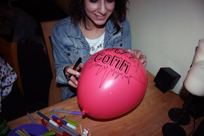
I finally got the final version of the PDF finished last night - and then designed the front cover today;
Again, it would have been useful to have had this done in the days of the group crits, instead I've just gone with what I wanted - in the hope that it suits everyone and feels relevant.
I decided on calling it 'Between us & them' because of the theme of us working for live clients. And also because, although the response was good - I didn't get any serious answers from my 'give it a name' forum discussion.
Although my favourite silly name came from James Robinson who came up with 'VIS-COM-BOBULATE'.
Saturday, 30 May 2009
Tuesday, 26 May 2009
Despite the deadline for submissions being yesterday - I am still receiving them into my email account which allows me to work at a steady pace and keep busy and focused. The deadline was just there to get people motivated in time. Its getting to the point now though where I need to be chasing those who haven't responded to my group email, facebook group invitation and facebook messages. I have received 18 submissions so far though! Another 20 to go before the Friday deadline! - Heres how I'm keeping it old school and keeping track...
Those who have not yet responded - prepare to feel my wrath!
Brick Wall
D'oh!
Sent my pages off to the client over the weekend and he got back to me yesterday saying how he likes them and is excited at how the book is beginning to take shape - but has had a 'Eureka moment' and has decided that the book should have a Professor on the front cover and then should appear in each page - I need to re-design my pages to accommodate this dude!!
His meeting with the mentor he has for the book was supposed to be today (and he was supposed to show my finished pilot to him), but because of his new idea - he has pushed it back, giving me time to rework the designs, but not in time for the college deadline. Boo!
Home made crit
I arranged to meet with my tutor today to run through my layout so far and get some advise from a pro. I found this so useful as I have missed the compulsory group crits with this brief being set quite late. There are a few things I will change about how I'm setting up my layout - but I feel rather re-assured that I'm moving in the right direction after hitting a brick wall last night. This has left me feeling just as enthused and excited about this project as I was to begin with.
I also invited a bit of peer assessment with those who were sat around the studio today. Feedback was good - some of those assessing it had work in my mock layout which sparked some interest. But its always hard to tell if my peers are just being nice or are genuinely liking the work without Graham around to spark some brutal critical feedback!
A very usefully spent afternoon though.
Had a pretty good response from my attempt at getting the message out to everyone about what they need to submit and when by (today)...
...which has meant I have been able to make some progress with getting the work into the layouts. Here are the 8 pages so far...
After a pretty long slog - I wanted to check my progress and converted the pages into a PDF to check their flick-ability... and its rubbish. It could be to do with me sitting in front of this layout all day. I've been reading about layouts using text in notes and handouts in my type journal. I've been fighting off widows & orphans, keeping columns narrow (but not too narrow), keeping my point at a good size and I've been lining up images with the text.
Hopefully I can talk to a tutor tomorrow to get some advice on what I'm doing wrong and how I could make it better.
Is it the colours?
Is it the mish mash of hand drawn titles?
Are my text boxes too different on each page? (can't be helped with different word counts - but maybe theres a way of handling it better?)
Its a shame there are no more crits left. This brief came along quite late in the project so I'm now beginning to realise how important peer assessment can be - and also receiving critical feedback from tutors.
...which has meant I have been able to make some progress with getting the work into the layouts. Here are the 8 pages so far...
After a pretty long slog - I wanted to check my progress and converted the pages into a PDF to check their flick-ability... and its rubbish. It could be to do with me sitting in front of this layout all day. I've been reading about layouts using text in notes and handouts in my type journal. I've been fighting off widows & orphans, keeping columns narrow (but not too narrow), keeping my point at a good size and I've been lining up images with the text.
Hopefully I can talk to a tutor tomorrow to get some advice on what I'm doing wrong and how I could make it better.
Is it the colours?
Is it the mish mash of hand drawn titles?
Are my text boxes too different on each page? (can't be helped with different word counts - but maybe theres a way of handling it better?)
Its a shame there are no more crits left. This brief came along quite late in the project so I'm now beginning to realise how important peer assessment can be - and also receiving critical feedback from tutors.
Monday, 25 May 2009
Slept on it...
Sunday, 24 May 2009
Heck!
Well the hand type works okay, but I changed the layout about to fit the text the best way around a landscape image, and keeping it similar to Richard's layout. Nomzamela has double the text that Richard does. Does it look right? I can't even tell. I've put it into 3 columns... but the first column looks wrong. But it also looks wrong when its the last column missing a few lines at the bottom. Need to play around come more with it.
T'n'T'd
Wow, I really wasn't expecting to like this, but it really... brings the page together. Maybe it has something to do with the monochrome picture? I don't know. I definitely need to try this out on other peoples layouts before I commit to anything.
Like, do I use the same style type for everyones name? Do I use the same colour? Some peoples names are harder to write than others.
Han-Jaab
Been thinking about maybe adding a hand drawn touch to the pages - with some nice hand rendered type.
In the book 'Hand Job' Mike Perry includes amongst the pages and pages of awesome hand drawn type, sections which have a little information about each contributing artist. Each artist seems to have included their own little title.
I don't think this would be manageable because A. People are busy and B. Not everybody has an interest in illustration - much of the work in this book will be from video artists, animators and photographers. I could always put it out there though...
I've had a go at making some type using a Wacom tablet in Photoshop. I've just chosen a select few names of the people I am guaranteed to received work from...
"SINGLE PAGE IMPACT!"
The brief now asks all students to submit one selected image of their work done for the Live Project brief (with a single page impact) with a 200 word max statement.
This has now changed the way I will work on this project - I was previously looking at ways of doing layouts with loads of images and a range of text sizes (but now I know its to be 200 max).
I need to be looking at new ways of creating a layout taking these factors into account.
This has now changed the way I will work on this project - I was previously looking at ways of doing layouts with loads of images and a range of text sizes (but now I know its to be 200 max).
I need to be looking at new ways of creating a layout taking these factors into account.
VIS COM 2 - PDF AWARENESS SOCIETY
Now that the brief has changed - I need to get hold of the the whole year group's selected images and 200 word statement.
The tutors are helping to promote the cause whenever they can.
But I needed a way to let everybody know. As well of telling people who I have come across in the studio and out and about, I got an email together and sent it to the course administrator, who then forwarded it on to all of year 2.
The group gives exactly the same message, but offers a place for discussion (I'm thinking about what the title of the PDF should be - rather than generic 'Visual Communication year 2 work'. On the group page I have set up a forum post asking for suggestions) The function to 'message all members' will be helpful when I need to give everyone a kick up the bum about the hand in.
The tutors are helping to promote the cause whenever they can.
But I needed a way to let everybody know. As well of telling people who I have come across in the studio and out and about, I got an email together and sent it to the course administrator, who then forwarded it on to all of year 2.
(click image to read)
I have received only 2 responses through this method.
I figured almost everyone in the year group frequently used Facebook. I decided to set up a group - A lot of the people invited to join had not previously heard about the PDF - and I've realised that it is going to mostly up to me now to get the work in ready to be put into the PDF.
The group gives exactly the same message, but offers a place for discussion (I'm thinking about what the title of the PDF should be - rather than generic 'Visual Communication year 2 work'. On the group page I have set up a forum post asking for suggestions) The function to 'message all members' will be helpful when I need to give everyone a kick up the bum about the hand in.
Saturday, 23 May 2009
Got my drawings and activity ideas together - neatened them up - scanned into the computer and put into an InDesign layout yesterday. I then printed a few copies off - One which I have sent to my client in time for his deadline.
Make a food chain mobile!
Colour in the these extinct mammals how you think they would have been...
Colour in this very easy method of naming planets!! Pull it out - its a poster!!
Susie is touching the Van Der Graaf - Draw how you think her hair looks...
Colour in the rainbow made by the prism with the colours in the correct order!
Fingers crossed for good client feedback!
Balloon Fest!
Subscribe to:
Posts (Atom)